
Portfolio
Nicholas Wrampe
Aquabats CD Cover
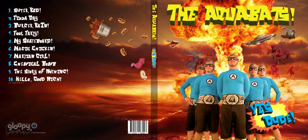
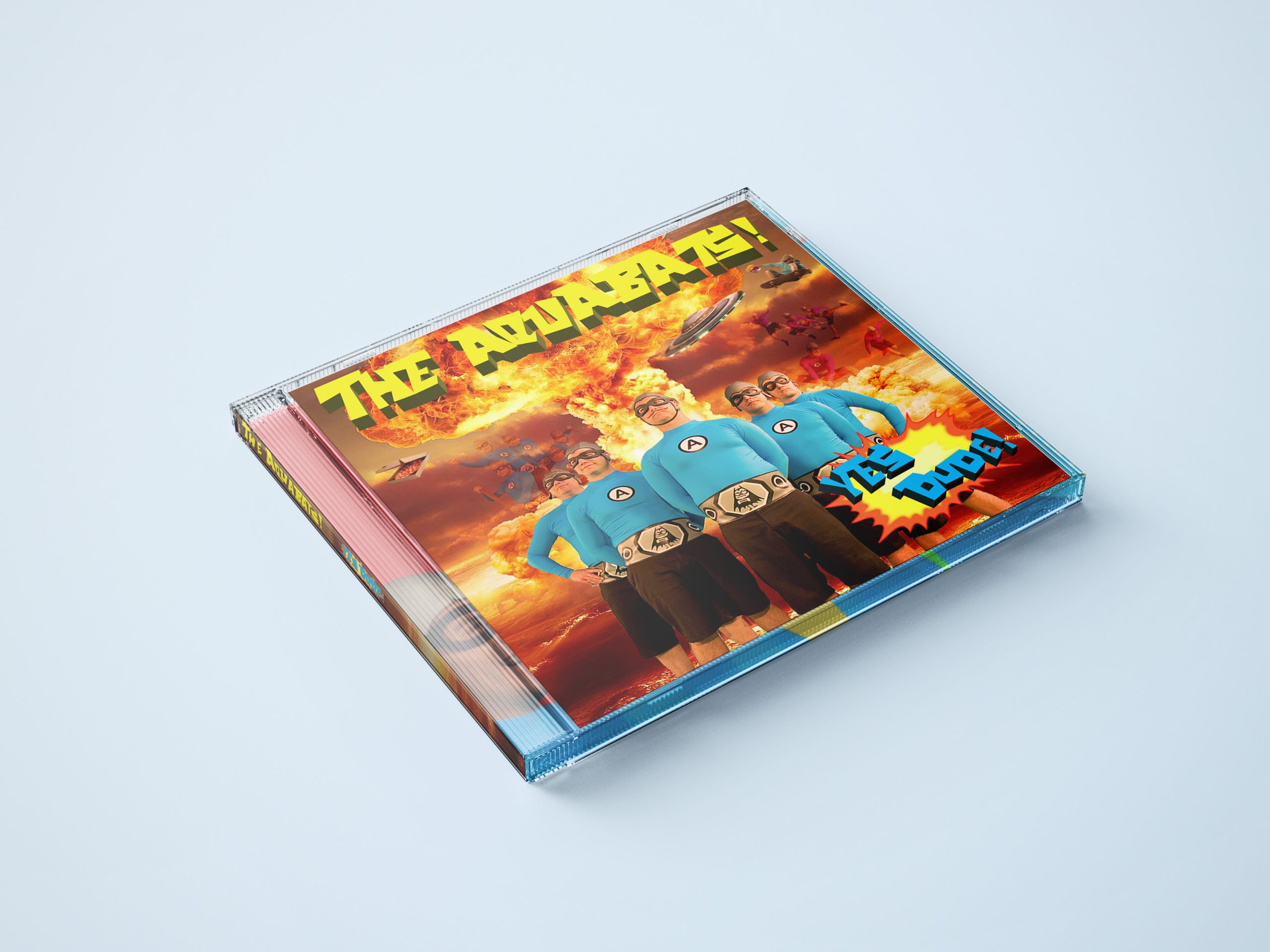
In my freshman year, the final project for my Photoshop class was to create a CD cover for any artist of my choosing. The goal was to make cover art for a compilation album, making use of multiple songs across an artist’s discography, and adding imagery that matched the themes of the songs listed on the back.
I chose to base my project around a 90’s ska band called “the Aquabats” simply because I was listening to them a lot at the time. I wanted to capture the corniness of the 90’s in the cover with my use of explosions, fire, and the font. The font is not very easy to read, but it is the band’s signature font and fits the theme, so I decided to use it throughout the project anyways. The phrase “Yes Dude” actually comes from my friend group. They were the ones that introduced me to this band, so I knew I was going to share this design with them afterwards.
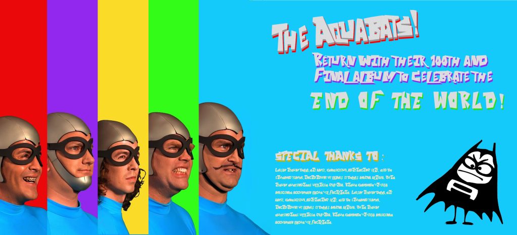
The inside of the sleeve is definitely more tame than the outside. I made it like this because I felt that it reflected their music a lot. Their songs usually shift from somber to upbeat and fast paced in a matter of seconds. The rainbow design on the left was made as a promotional piece by someone else. I got it from this article. I wanted the lead singer on the rightmost side so that I could fill the rest of the sleeve with their signature blue color, so I rearranged the order of the members. The shoulder of the lead singer was cut off because he was originally in the middle, so I had to use the stamp tools mixed with the content aware fill tools to fix it.