
Portfolio
Nicholas Wrampe
Logo Design
I was told to create logos for three different companies all under the name “Zephyrus.” The only difference between these fictional companies was the product that each of them sold. Before I started designing, I first did research on what “Zephyrus” meant, and found that Zephyrus is the god of the west wind in greek mythology. Based on the different contexts of each company and the background of the name Zephyrus itself, I developed the three different logos shown below.
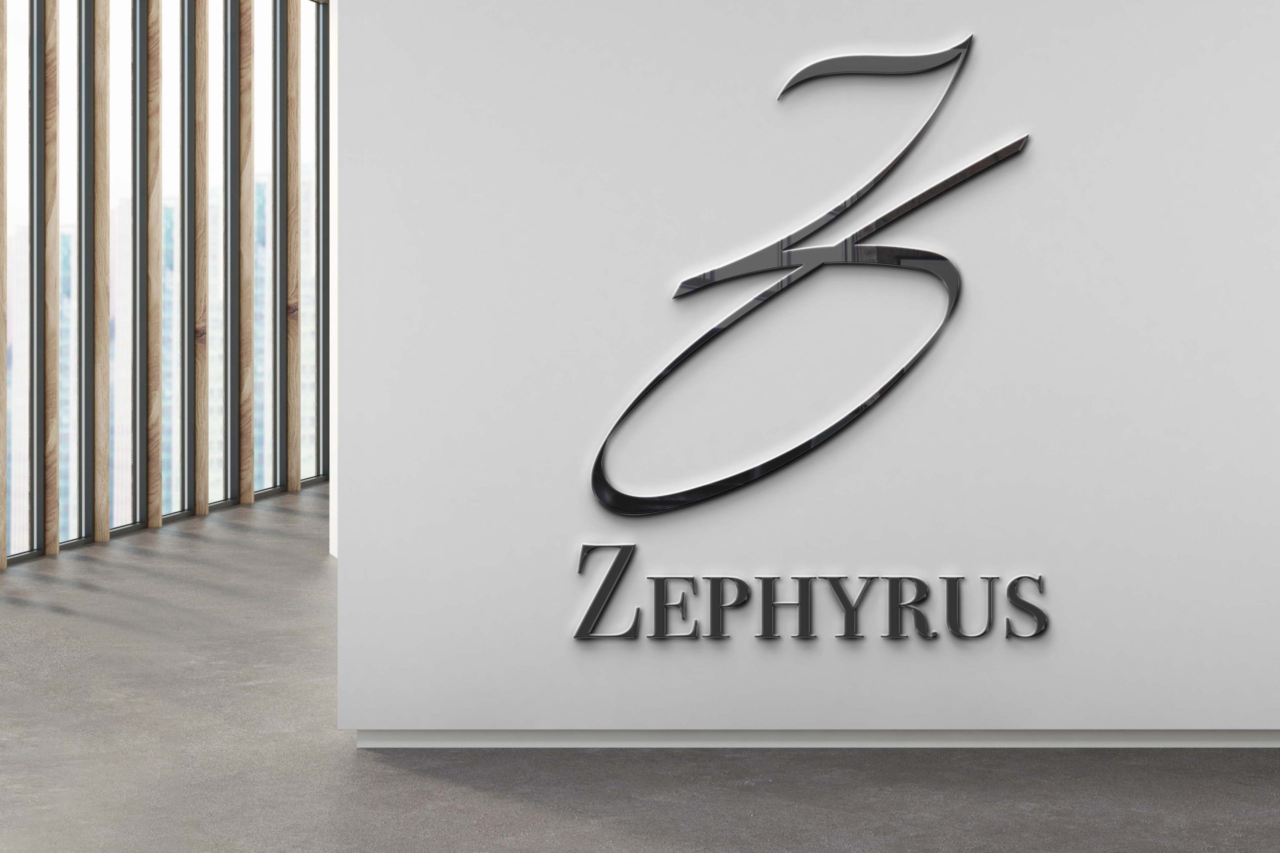
Luxury Watch Company
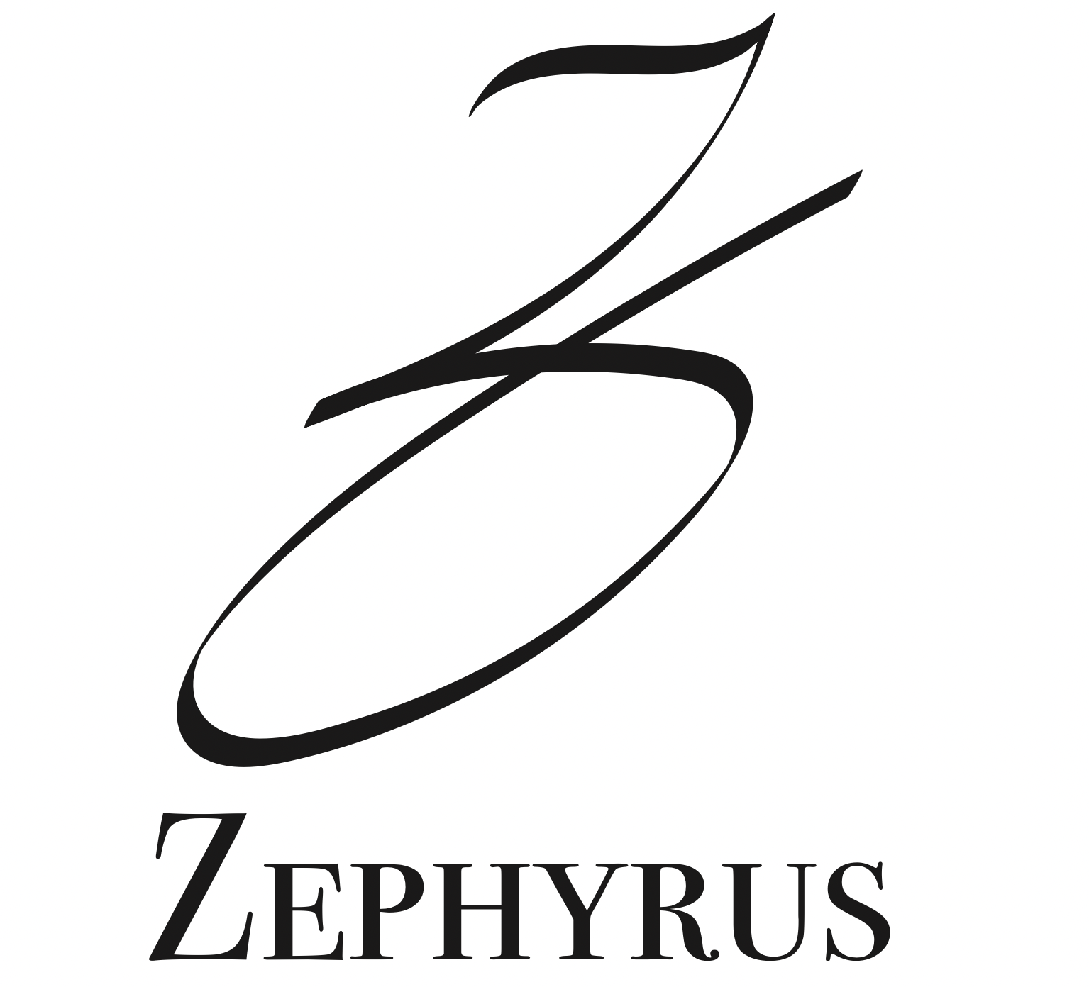
When I began this design I knew that I had to somehow capture the sophistication that is expected of a brand such as this. I spent a large amount of time thinking about how I could demonstrate this while still holding true to the Ancient Greek theme. I decided on using the cursive letter Z, as it both demonstrates sophistication, and resembles the greek Zeta symbol better than the English Z. After many attempts using the paintbrush tool in illustrator, I came out with the logo on the right. I used the font Bodoni for the text at the bottom of the logo because I thought that it further progressed the theme of sophistication. Capitalizing the Z at the beginning of the text was meant to emphasize the usage of the letter Z in both the symbol and the text below it.
Extreme Sports Equipment Company
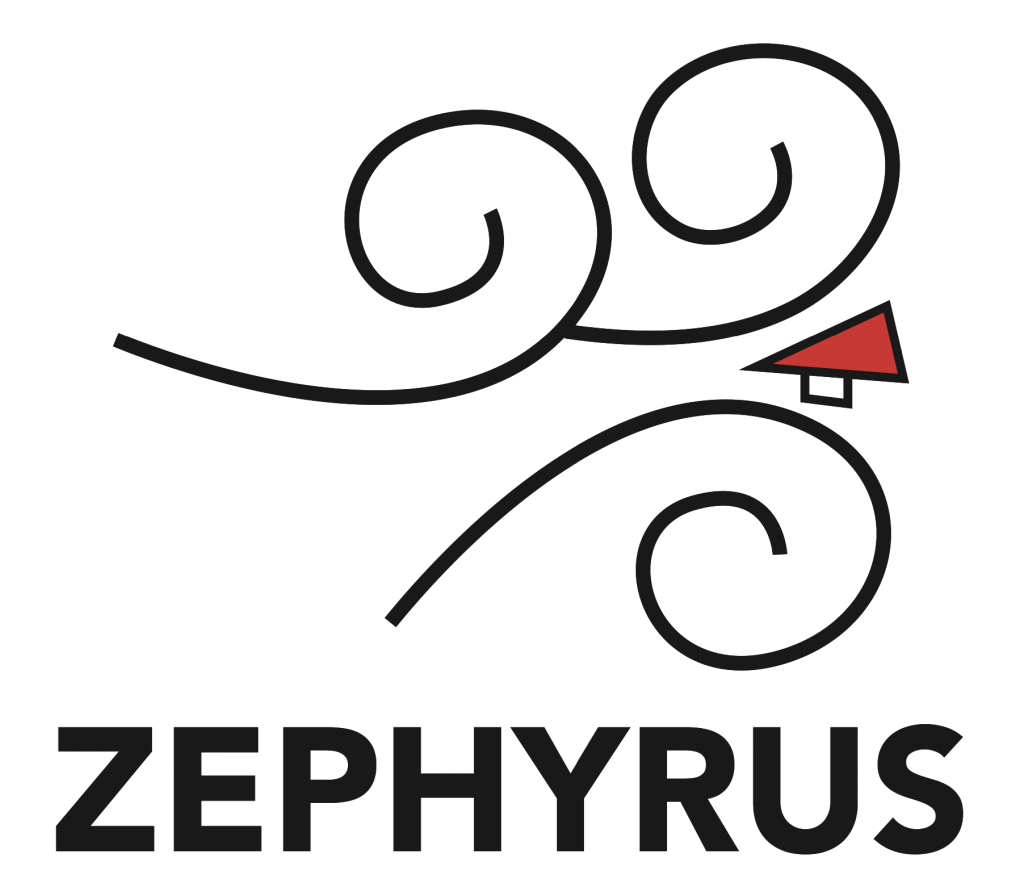
Even though the process of creating this logo was much easier than the last, it still emphasized the purpose just as well if not better than the previous logo. I not only included the west winds coming from the left to the right of the logo, I also researched how winds were illustrated in Greek art and simplified it to make it work better on a logo. To include the extreme sports aspect, I added a hang glider and made it bright red to attract the eye to that spot. When your eyes are attracted to the hang glider, it gives you a good idea of what the company is about. The text font is Avenir, and was used because when bolded, Avenir can look like a very intense, and almost adventurous font.
3D Modeling Company
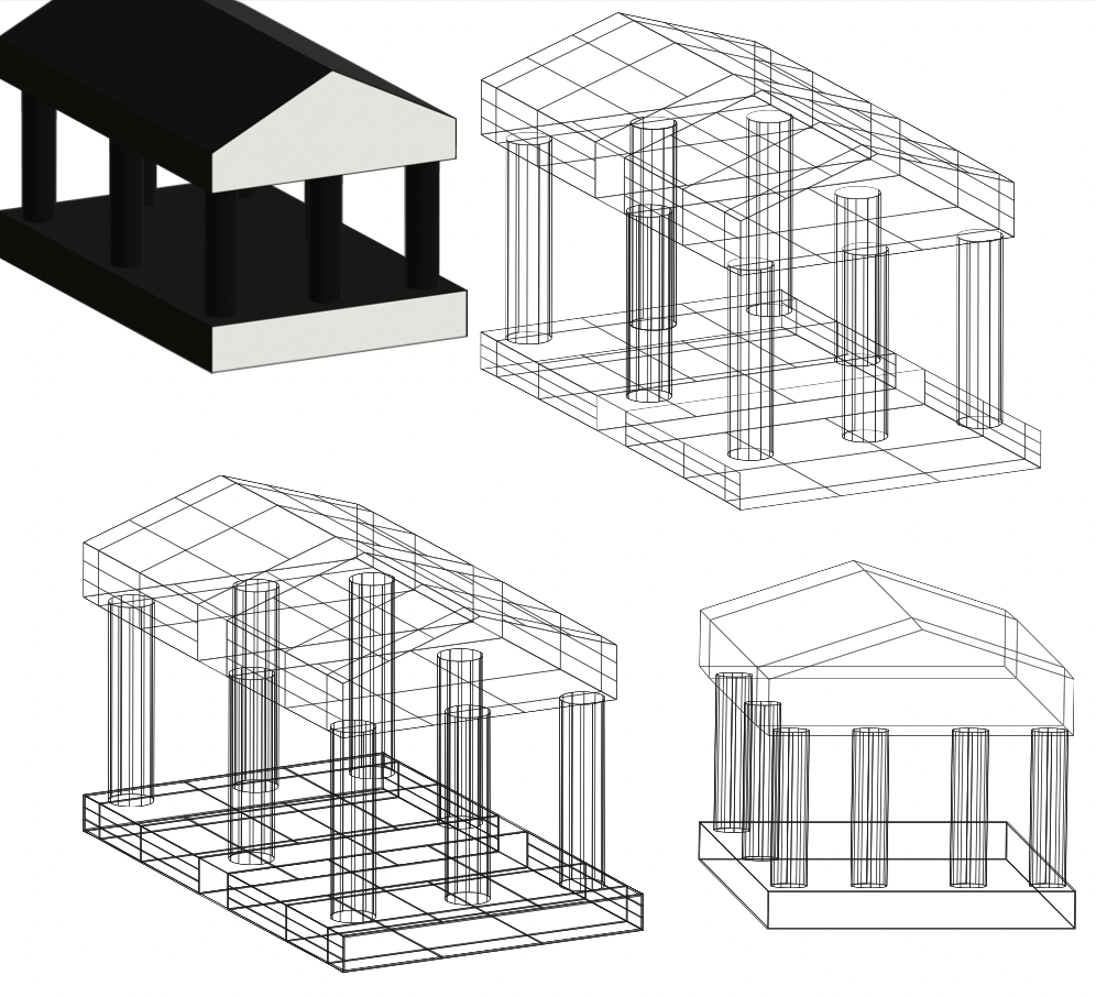
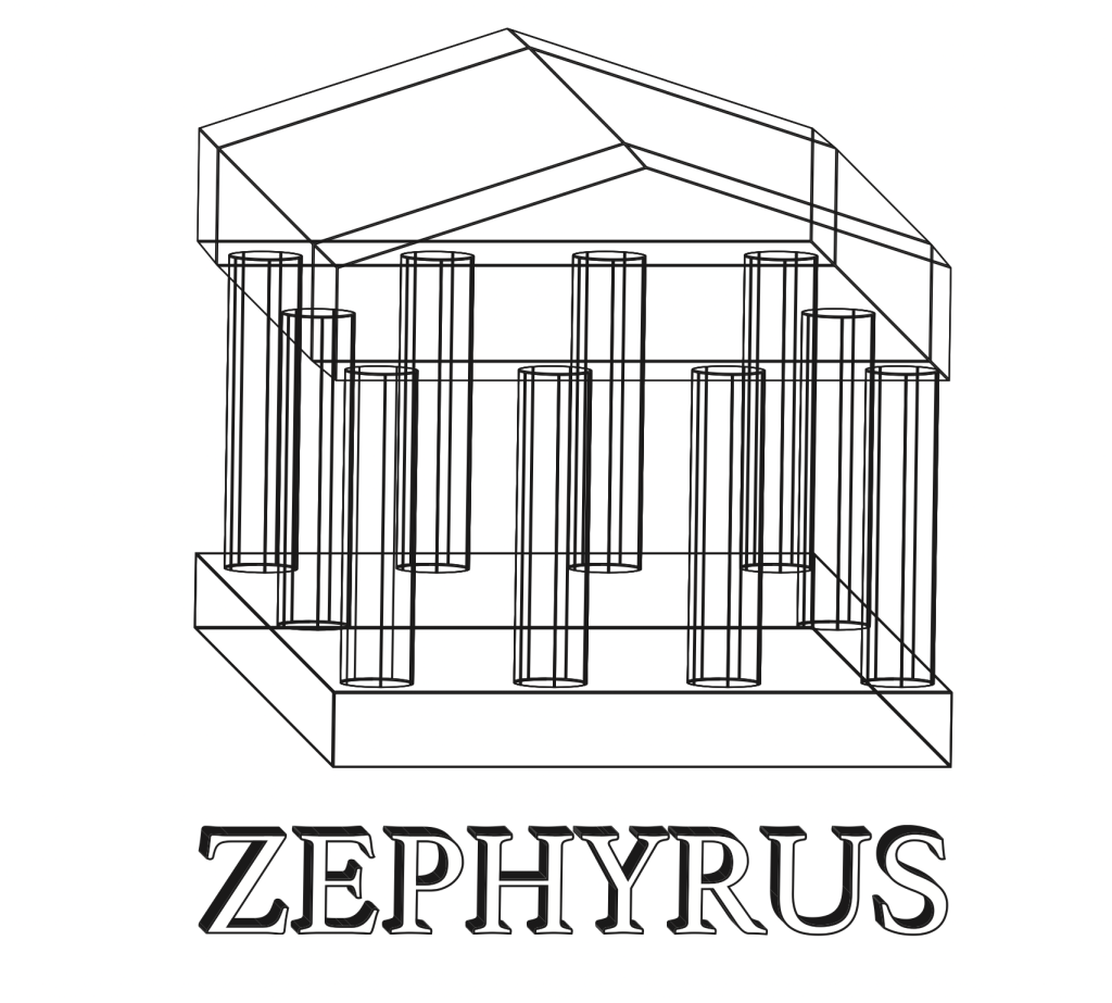
There were a lot of problems that came up while trying to make this logo. I got inspired by a logo that used a wireframe depiction of a building and I wanted to carry that idea over to this project. The 3D modeling aspect Is shown with this idea, and I decided to use a simplified Parthenon to include the Greek aspect. The new version of the extrude and bevel tool did not have a wireframe option, so I had to use the old version of this tool. Once I got everything into place, the depiction of the parthenon looked very busy. I had to create outlines of the model and delete specific lines in the model until I was happy with the result. I carried over the 3D look into the text, using the extrude and bevel feature one last time. I don’t think this came out as good as the other two, but I think it was a good concept overall.