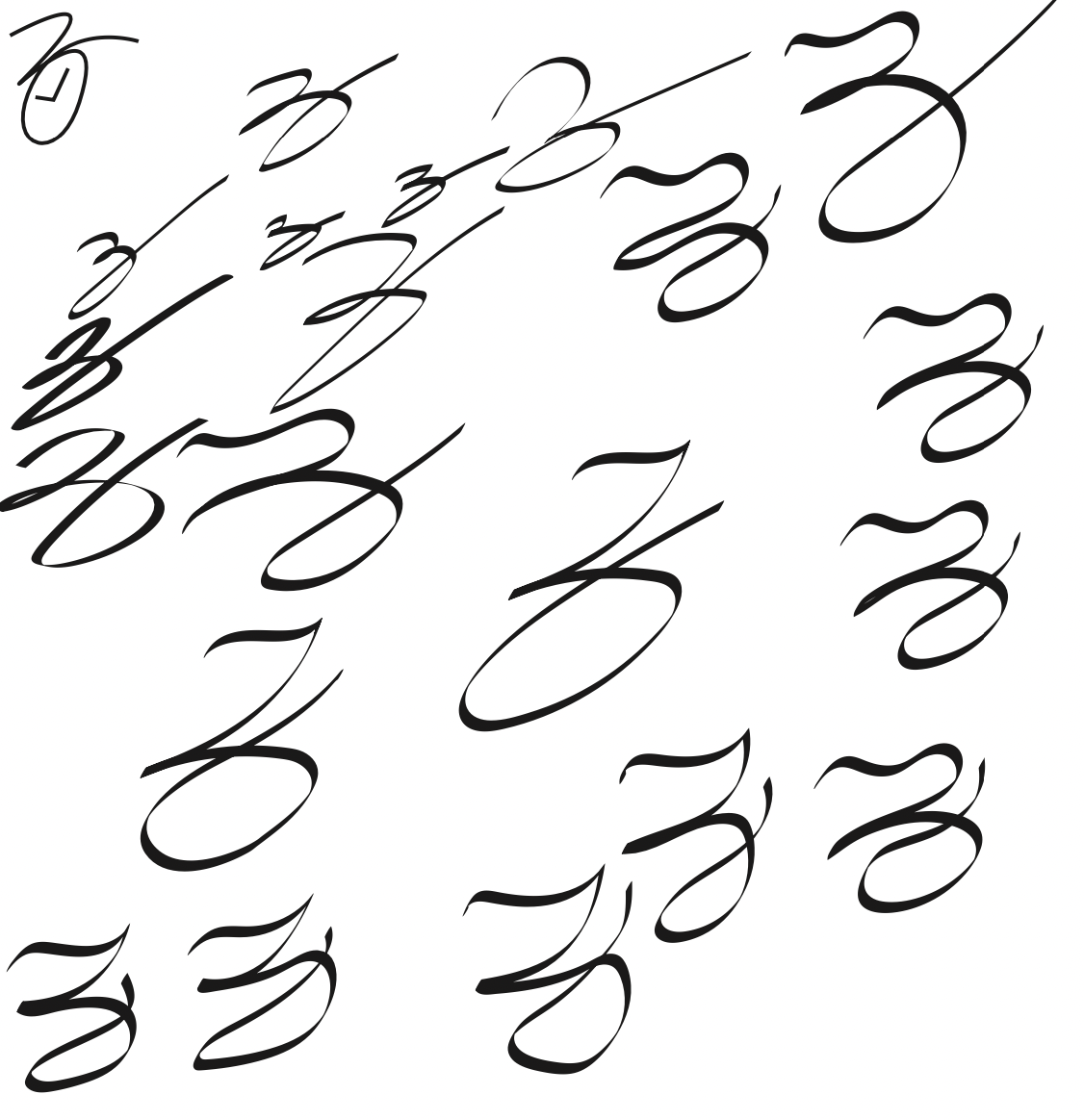
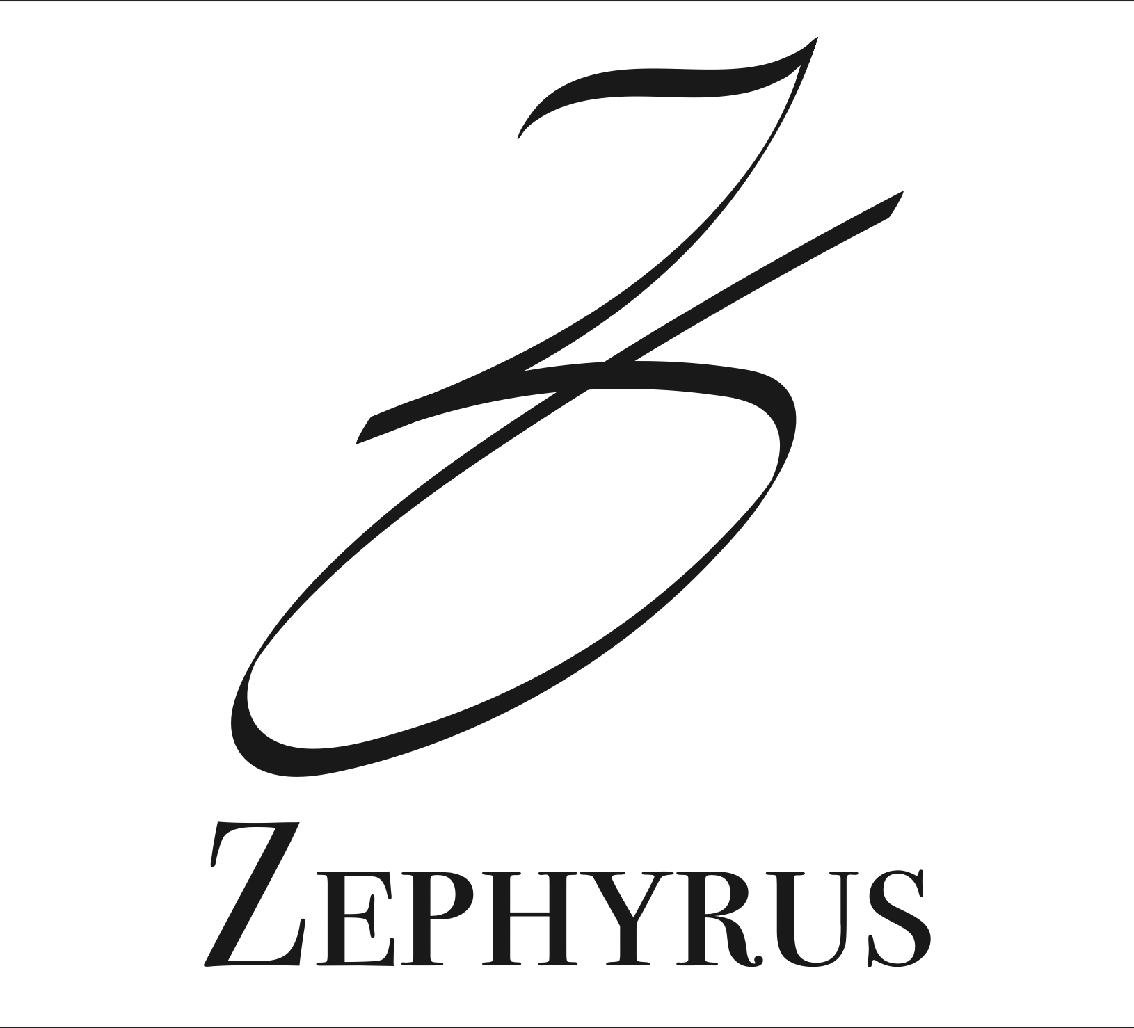
Shown above is my process for designing this logo. Only being told the name along with the fact that it is a luxury watch company, I immediately started drafting. The first thing that came to mind for this logo was to heavily lean on the use of a cursive Z. After drafting on paper, I took my work into Adobe Illustrator and got to work on designing the perfect letter Z. Once I got one near perfect, I selected the appropriate stroke for my pen line, traced it and expanded, and finally got down to the finishing touches. Unfortunately, I am unable to find the exact name of the font used below the logo, but I remember choosing it specifically for its elegance and grace. It emphasizes the luxury feel without taking away from the cursive Z shown above.